
Addictive E-Commerce
Addictive e-commerce design
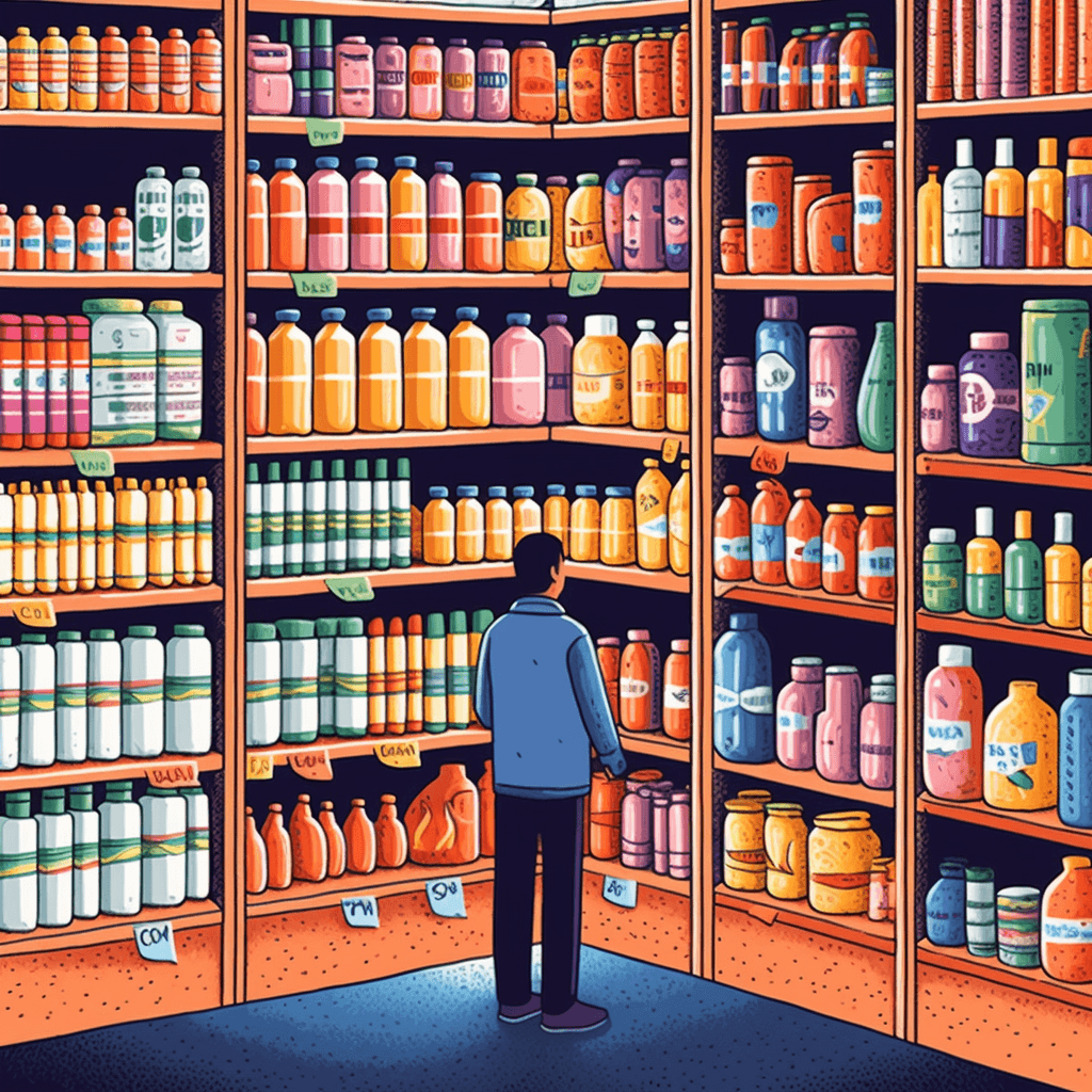
The transformative power of the internet has revolutionized the business world. Shopping, as we knew it, has metamorphosed dramatically, propelling us into a future where products and services are only a click away. As exciting and convenient as this paradigm shift appears, it has also triggered an evolution in consumer habits. This shift has led to the emergence of an unanticipated phenomenon: the addictive design of e-commerce platforms.
In the realm of e-commerce, the line between 'shopping' and 'online shopping' is rapidly dissolving. The accessibility, vastness of choice, instant gratification, and highly personalized shopping experiences of e-commerce have contributed to its skyrocketing popularity. However, beneath the seamless user interface, attractive discounts, and the 'one-click' checkouts lies an intricate web of design elements intended to increase user engagement and consumption. This intentional craft has been deemed 'addictive e-commerce design.'
In essence, 'addictive e-commerce design' refers to the strategic orchestration of user interface and user experience (UI/UX) design elements that motivate continuous and increasing engagement on e-commerce platforms. Often subtle and inconspicuous, these design techniques leverage human psychology, focusing on our behavioral tendencies and capitalizing on them to stimulate habitual use and consumer spending.
In a world that is becoming increasingly digital, understanding the nature of our interaction with e-commerce platforms is no longer an option but a necessity. As we embark on this journey, we hope this exploration will equip readers with a more profound understanding of their online shopping experiences and ignite informed conversations around responsible e-commerce design and consumer protection.
The more time a user spends on our site, the more opportunities we will have to persuade them to make a purchase, and additionally, they will spend less time on competitors' sites. E-commerce sites employ various mechanisms that extend the user's session. Below I describe several basic mechanisms that are considered addictive.
Infinite Scroll

Technical people don't favor this solution due to the lack of access to all results, such as search results, yet many portals still implement this solution. Why?
Traditional pagination provides clear information to the user that they have just passed the first page, giving them a moment's respite during which the brain can change its context and decide to switch stores. Scrolling does not require any truly conscious action, whereas to move to the second page of results, the user must make a conscious decision to remain on the page. It's like reaching a crossroads. We can walk the entire way unconsciously, but approaching the crossroads can wake us up from that lethargy.
It's like reaching crossroads. Users will have to make this decision upon moving to each subsequent page. Users may also desire to view only the first page of results, which is considered the most accurate. With infinite scrolling, noticing how far one has gone in their searches is difficult.
Building Memories

A user who has spent time on a website and has shown emotional involvement will see purchase decisions through the lens of that involvement. Also, this user will be less willing to leave a given portal. To encourage users to engage emotionally and invest their time, we must provide them with activities or interactive experiences on our website. Here are a few things that fit well with e-commerce and work effectively:
- saving comparisons
- saving shopping lists
- creating favorite lists
- remember the contents of the cart between user sessions
- simplify account registration to a minimum
- store customization
- post reviews and ratings
Building memories will make the user not want to abandon all the achievements they have acquired. Unfortunately, many systems do not have such features in their basic version, which is why we encourage you to contact us for consultation on how to add such features to your existing system.
Limited Number of Options
At first glance, the more products, the better. However, when choosing from too many options, the user will be overwhelmed by the choice and will not feel that they have analyzed and selected the best product. Such negative feelings will hinder making a purchasing decision.
A limited set of options allows users to feel they have control over the process. They want to feel the satisfaction of choosing the best product and making the best possible deal. You can additionally help them with a good product comparison tool.
For a small portion of users, the lack of access to the entire range of offerings will be a problem. That’s why we should prepare the ability to display everything they want to see and provide them with an efficient filtering mechanism. But it should never be a default option.
Product Comparison
Product comparison may seem to serve its purpose only when there are many products to compare. However, it complements the limited number of options because in order to properly compare products, there must be a limited number of them. A user who can compare products will get a sense of completeness of their choice and a feeling that the portal is not trying to push anything since it provides them with tools to choose the best option for themselves.
Product Suggestion
People browsing a website don't always know everything you offer. What if you offer products they need, but the user is unaware you have them? Sales lists (cross-sell, up-sell) are great for introducing users to our offer. Users get related products that they weren't searching for but may be interested in. Often, users click on such lists interested in other products. We need to ensure the products that appear aren't too similar or repetitive. In the case of well-designed recommendation lists, users stop searching for products independently and embark on a journey guided by our suggested items.
This system works best for clothes or jewelry as these products are chosen visually rather than based on technical parameters. In these domains creating effective filters based on visual attributes is challenging.
Reward Mechanism
This is the most addictive mechanism that works on people. The origins of this mechanism come from web applications, which often utilize this mechanism to attract users and engage them by guiding them through the application's learning process. There is no reason why similar mechanisms couldn't be implemented in e-commerce to attract and engage users in a similar way.
- You've made 1 out of 5 orders to get free shipping.
- Make three more orders to get a 15% discount
- Write two more reviews to reach silver user status
This method works best when users shop with us regularly because it allows them to see their continuous progress. Another reward mechanism is to offer random discounts or any loyalty system. Sometimes we can show the user a 5% discount on a random page with a given code. The user's brain will associate browsing our portal with actual profit and pleasure.
Gamification
You can add elements of gamification to your website as well. Gamification doesn't mean actual games here. A good example would be dividing the checkout page into several steps for more complicated forms. While filling in the data at each step, we can put information at the top about the number of steps in the process and the percentage of process completion. People like to finish things, so such a step counter can subconsciously affect the user.
Another interesting way of introducing gamification could be a progress bar showing how much more is needed to reach the free shipping threshold. This can encourage the user to add one more product. Gamification works especially well with grocery shopping when the user can always buy something useful to have on hand.
It's embarrassing to admit, but I often do the same. If I'm just a small amount away from qualifying for free shipping, I usually add some dishwashing liquid or laundry detergent that I know I'll need to purchase soon anyway.
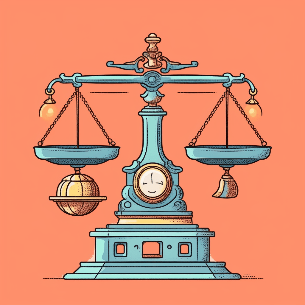
Responsibility
It's important to note that all methods should be used with care. Social media platforms have pushed these techniques to the limit, and their users feel the negative effects. User awareness is constantly growing, so the mentioned techniques should be applied carefully to avoid self-harm. Our products should be our greatest advantage, followed by their price, and only then the entire supporting framework.
Moral Aspects of Addictive E-commerce Design
The ethical implications of addictive e-commerce design are significant and warrant careful consideration. While the goal of e-commerce platforms is undoubtedly to generate sales and retain customers, there's a fine line between providing engaging and user-friendly interfaces and employing manipulative tactics that may exploit customers' psychological vulnerabilities. The moral compass of e-commerce design should be guided by principles of fairness, transparency, and respect for the customer's autonomy. Therefore, while it's acceptable to implement strategies aimed at improving user experience and encouraging sales, such strategies should not lead to compulsive usage, financial distress, or other negative consequences for the user. The design should empower customers with knowledge and options, not trick them into making impulsive decisions.
Summary
This article explored the concept of addictive e-commerce design, analyzing various strategies that e-commerce sites employ to encourage users to spend more time on their platforms, thereby increasing sales. The ethical implications of these strategies were also discussed, emphasizing the need for responsible use of these tactics to ensure they do not harm or manipulate users. Ultimately, e-commerce sites must strike a balance between creating an engaging user experience and respecting their customers' autonomy and well-being.
Ask us any question
We will respond within 8 hours and guide you in the right direction.
Your data is safe with us. We will not share your email with anyone, and we will use it only to contact you regarding your inquiry.